Critical Questions Every Dentist Should Ask About Their Website
Rashid Munir
Did you know a simple tweak in your website’s design could skyrocket your dental practice to the top of Google searches?
Yes, it’s that powerful. In today’s digital age, where a Google search decides who gets noticed, many dentists are left wondering why their websites are invisible. The secret? It’s all in the design. A great design attracts more patients and sets you up as the go-to dentist in town. On the flip side, poor design can mean you’re hardly found. Let’s fix that.
This article reveals easy, actionable steps toinstantly boost your site’s appeal and visibility. Get ready to transform your website into a patient-attracting magnet, effortlessly.
Take a moment to view your website through your patients’ eyes. As you navigate, ask yourself:
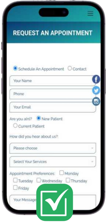
Is It Mobile-Friendly? In an era where everyone's on their phones, can patients easily access and navigate my site on any device?
In 2023, over 85% of the US population used a mobile phone to access the internet. That figure is expected to rise, reaching 89% in 2029. Americans use their phones to answer urgent medical questions, book medical appointments, and, according to Pew, access their medical records. Unless your website is optimized for both mobile devices and desktop computers, you’re missing out on a significant chunk of the patient population. Younger demographics, in particular, rely on mobile devices for completing everyday tasks.
Indeed, 85% of adults think a company’s website should be as good or better than its desktop website when viewed on a mobile device.
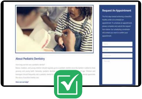
Ensure that everything is readable and accessible on a mobile device. Redesign parts of the website to fit inside the mobile’s aspect ratio and consider what features you could alter to make things easier. Look at the design below – it fits perfectly on the screen, is easy to read, and uses large fields suitable for a touch screen.
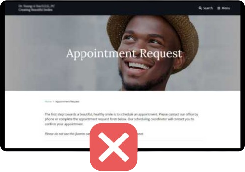
Where's the Call-to-Action (CTA)? Do I clearly guide visitors to book an appointment?
What is a call to action? It’s a powerful message that tells the patient precisely what you want them to do next. Usually, CTAs are placed on buttons to encourage visitors to click. Bold colors highlight the button and draw the visitor’s attention.
A clearand compelling call-to-action button is crucial to guide patients in taking the next step, which could be booking an appointment, calling your office, or subscribing to a newsletter. It is important to position CTAs strategically throughout your website, especially on the homepage and at the end of informative sections. This will encourage engagement and reduce bounce rates. will encourage engagement and reduce bounce rates.
Don’t just say “Appointment Request” like the page on the right without including a CTA button. See how the other design includes an eye-catching orange button with a clear CTA, “Book an Appointment.” It’s unmissable!
How Simple Is It? Is my website clutter-free and straightforward, inviting patients to explore without confusion?
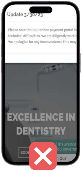
Simplicity is crucial in healthcare website design. Busy and cluttered websites can confuse visitors, leading them away from the information they need. Instead, utilize clear headings, a logical navigation menu, and a clean layout. layout.
White space might seem like empty space – but it’s not. It serves to direct a patient’s attention to the most important information
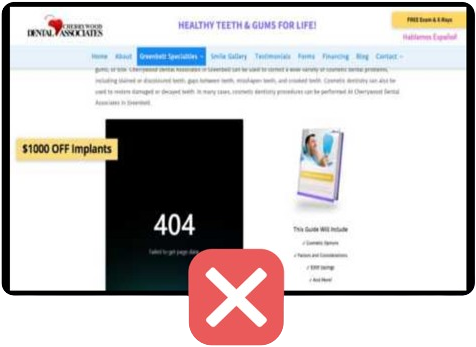
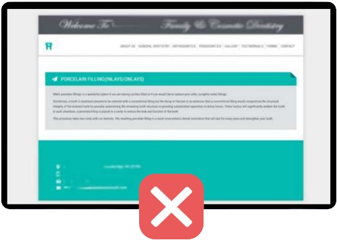
As seen in the two example web pages, one is well-organized, with a simple color scheme and clear sections. The other, on the other hand, has broken links, multiple colors, and a disorganized layout. Which one would you prefer?
In addition, avoid overwhelming visitors with too much information at once or using medical jargon that might confuse them.
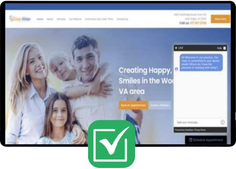
Are My Images High-Quality? Do the visuals on my site immediately convey professionalism and the high standard of care patients can expect?
Visuals can speak louder than words. High-quality images, including photos of your team, facility, and any procedures or equipment, can help build trust and set patient expectations.
Did you know that slow-loading images can be a problem for websites? This is because the higher the quality of the image, the slower it takes to load. Slow-loading images can cause frustration for website visitors, leading to a decrease in engagement. In fact, 39% of people will stop engaging with a website if the images won’t load or take too long to load. To prevent this, it’s important to balance clarity with the image’s file size. This means ensuring that the image looks good but doesn’t slow the website down to a crawl.
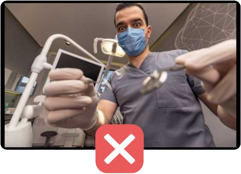
Think about the images displayed below. Avoid images like the man on the right – it’s terrifying! Your photos should be friendly, warm, and professional, just like the female dentist on the left.
Is My Content Valuable? Am I offering the insights, tips, and information that my patients are actively seeking out, establishing my practice as a trusted resource?
Patients who visit a doctor or dentist expect clear, concise advice about their health. Your website should do the same. Offer valuable information that answers common patient questions, details your services, and highlights your expertise.
That being said, the average user spends5.59 seconds reading your website’s written content. More often than not, people are skimming your website copy. You should provide just enough written content to convey your point, and not a sentence more.
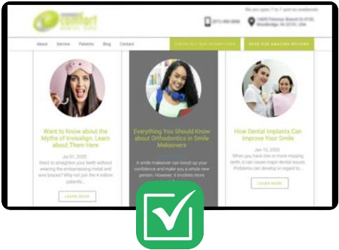
Consider the two examples – one has no images, lengthy sentences, and no other information. On the other hand, the design on the left contains short, straightforward paragraphs divided into sections by the design. At a glance, a patient can learn everything they need to know.
Reflecting on these questions isn’t just about ticking boxes; it’s about genuinely connecting with your patients and ensuring their first online impression of your practice is as positive and reassuring as the care they receive in person.
Ready to elevate your practice? Join a community of forward-thinking dental professionals committed to excellence. By subscribing below, you’re taking the first step towards a thriving practice with a standout online presence.
Would you like us to send you similar helpful articles straight to your mailbox